- Published on
Exploring Data Visualization with D3 JavaScript: My FreeCodeCamp Journey
Introduction
Embarking on a captivating voyage of data exploration, I immersed myself in FreeCodeCamp's Data Visualization Projects course, with a primary focus on D3 JavaScript. Throughout this course, I harnessed the power of D3 to create four distinctive and informative charts, each providing unique insights into complex datasets. Join me as I unveil the intricacies of my Data Visualization Projects, where I visualized GDP timeseries, exposed doping in professional bicycle racing, mapped monthly global land surface temperatures, and explored video game sales data through a stunning treemap.
Bar Chart: Unveiling GDP Timeseries Trends
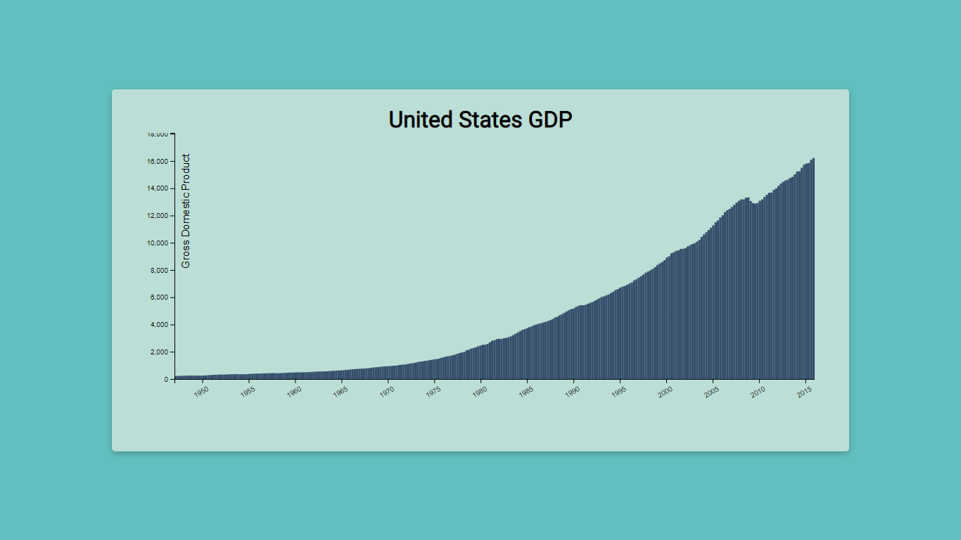
In my first data visualization endeavor, I crafted a compelling bar chart to depict the GDP timeseries of a country. Leveraging D3's dynamic features, I showcased the fluctuation in economic growth over a period of time, allowing users to gain valuable insights into the country's economic performance. The bar chart offered an intuitive and visually engaging representation of the GDP data, making complex economic trends accessible to a wide audience.
Scatterplot Graph: Visualizing Doping in Professional Bicycle Racing
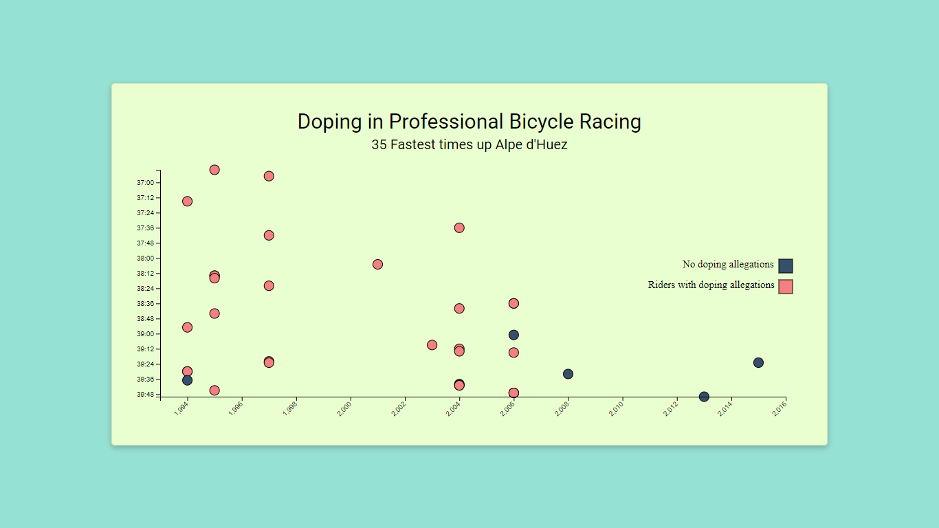
Moving on to my second project, I employed D3's powerful capabilities to create a scatterplot graph that exposed doping instances in professional bicycle racing. This visualization unveiled the correlation between doping allegations and race performance, offering a compelling narrative on the integrity of the sport. The scatterplot graph facilitated a deeper understanding of the impact of doping on the competitive landscape, encouraging discussions on ethics and fair play.
Heatmap: Mapping Monthly Global Land Surface Temperature
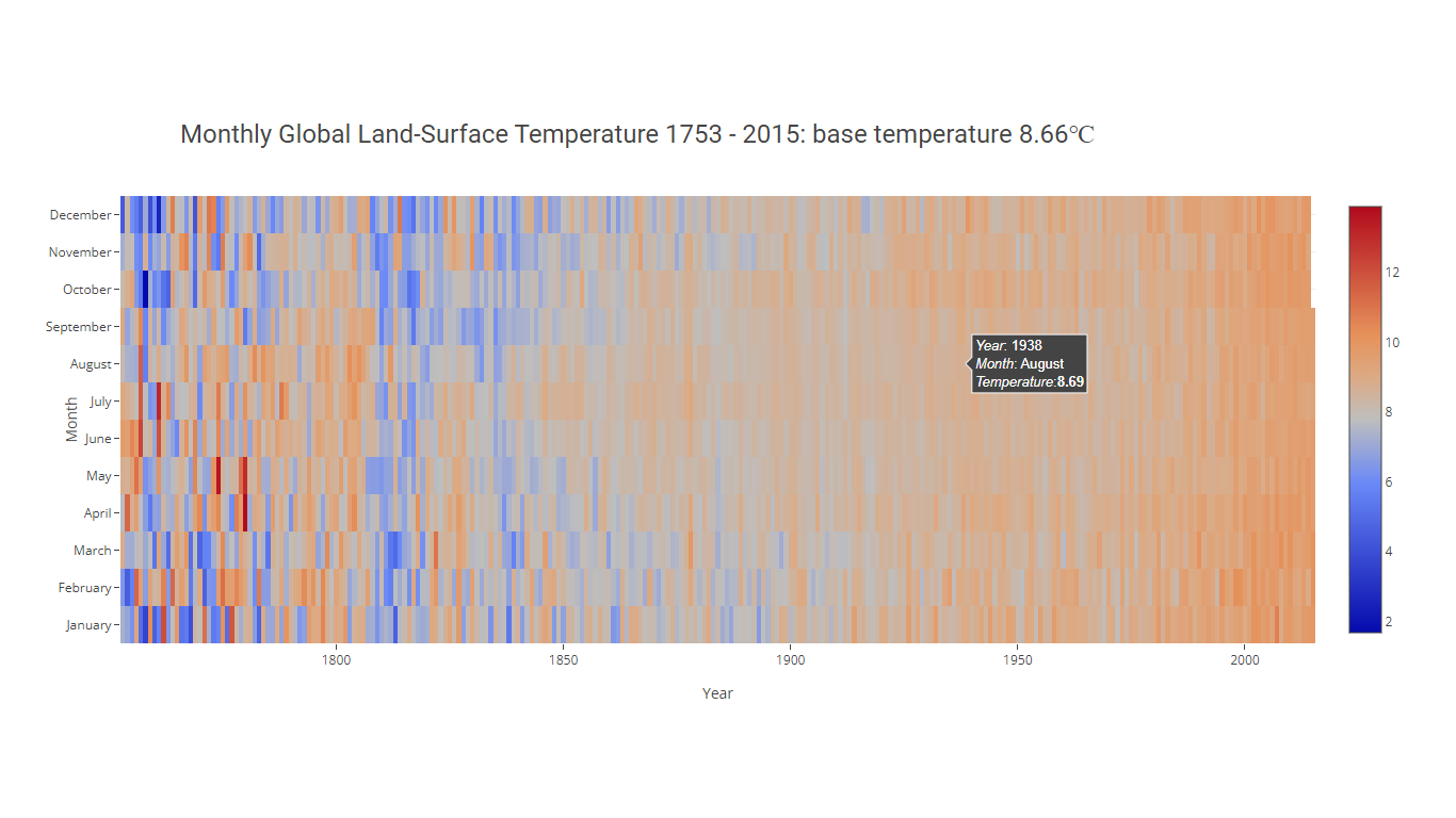
For my third project, I delved into the realm of climate data visualization. Leveraging the user-friendly Plotly library, I crafted an interactive heatmap to showcase the monthly global land surface temperatures over time. The heatmap's vibrant color spectrum brought life to the data, enabling users to explore temperature trends across different months and regions. This visualization provided crucial insights into climate patterns, fostering awareness and discussions on environmental changes.
Treemap: Exploring Video Game Sales Data by Platform
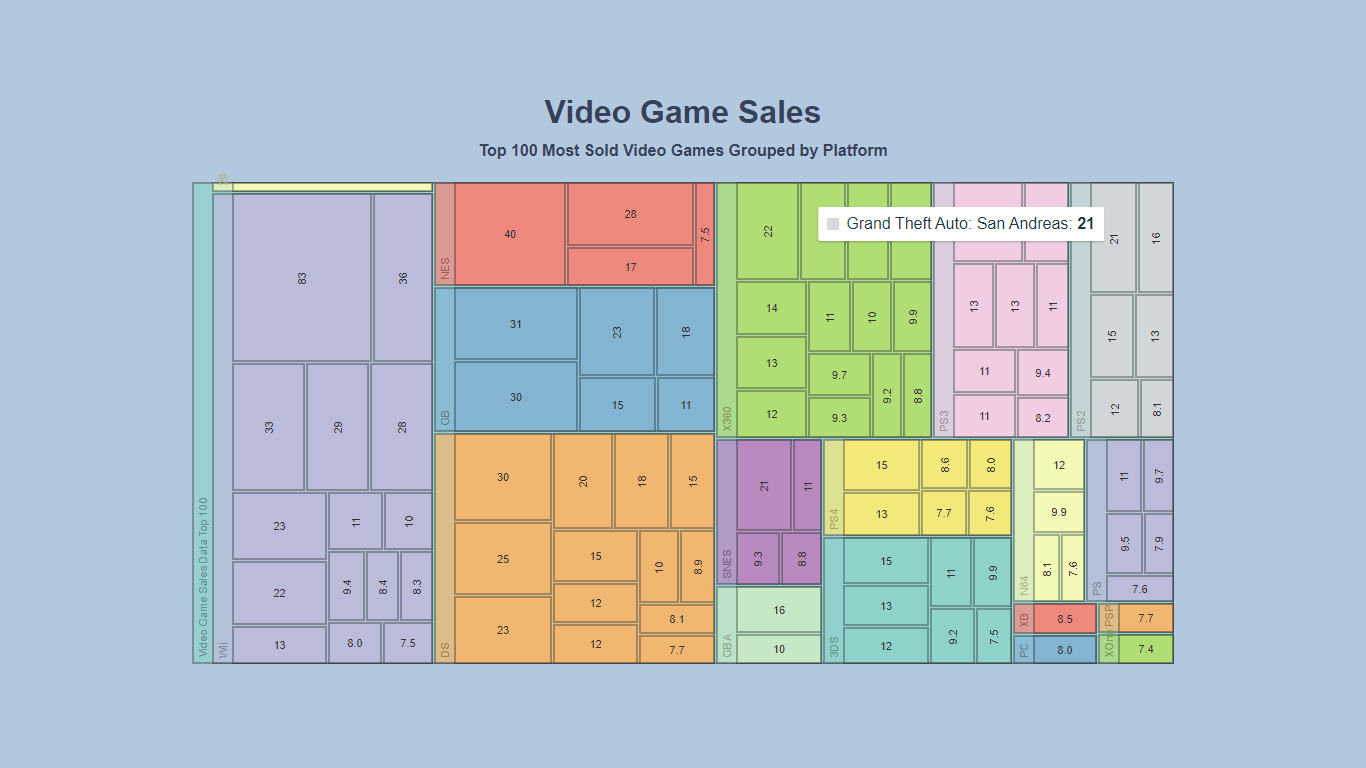
In my final project, I ventured into the realm of video game sales data visualization. This time, I turned to the powerful Nivo library to create a captivating treemap that grouped video game sales data by platform. The treemap offered a hierarchical representation of sales figures, highlighting the market dominance of various gaming platforms. This visualization became a valuable tool for developers and stakeholders to make informed decisions in the competitive gaming industry.
Conclusion
The Data Visualization Projects course from FreeCodeCamp has been an enriching journey of mastering D3 JavaScript and leveraging diverse libraries to create compelling visualizations. From revealing GDP timeseries trends to mapping global temperatures and uncovering insights in video game sales, each project has honed my skills in data exploration and presentation.
As I continue my exploration in data visualization, I am eager to explore new datasets and harness the power of D3 JavaScript to craft impactful visual narratives. These projects have equipped me with the knowledge and tools to translate complex data into captivating visual stories, facilitating data-driven decision-making and sparking discussions on critical issues.


